Designing Security: A Full Rebrand + Website Overhaul for OS Systems Ltd.
OS Systems Ltd. came to us with the goal of updating their brand to reflect who they are today. Their old branding lacked cohesion, depth, and a strong identity and their digital presence especially the website, wasn’t telling the right story.
Branding Direction
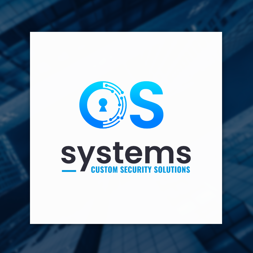
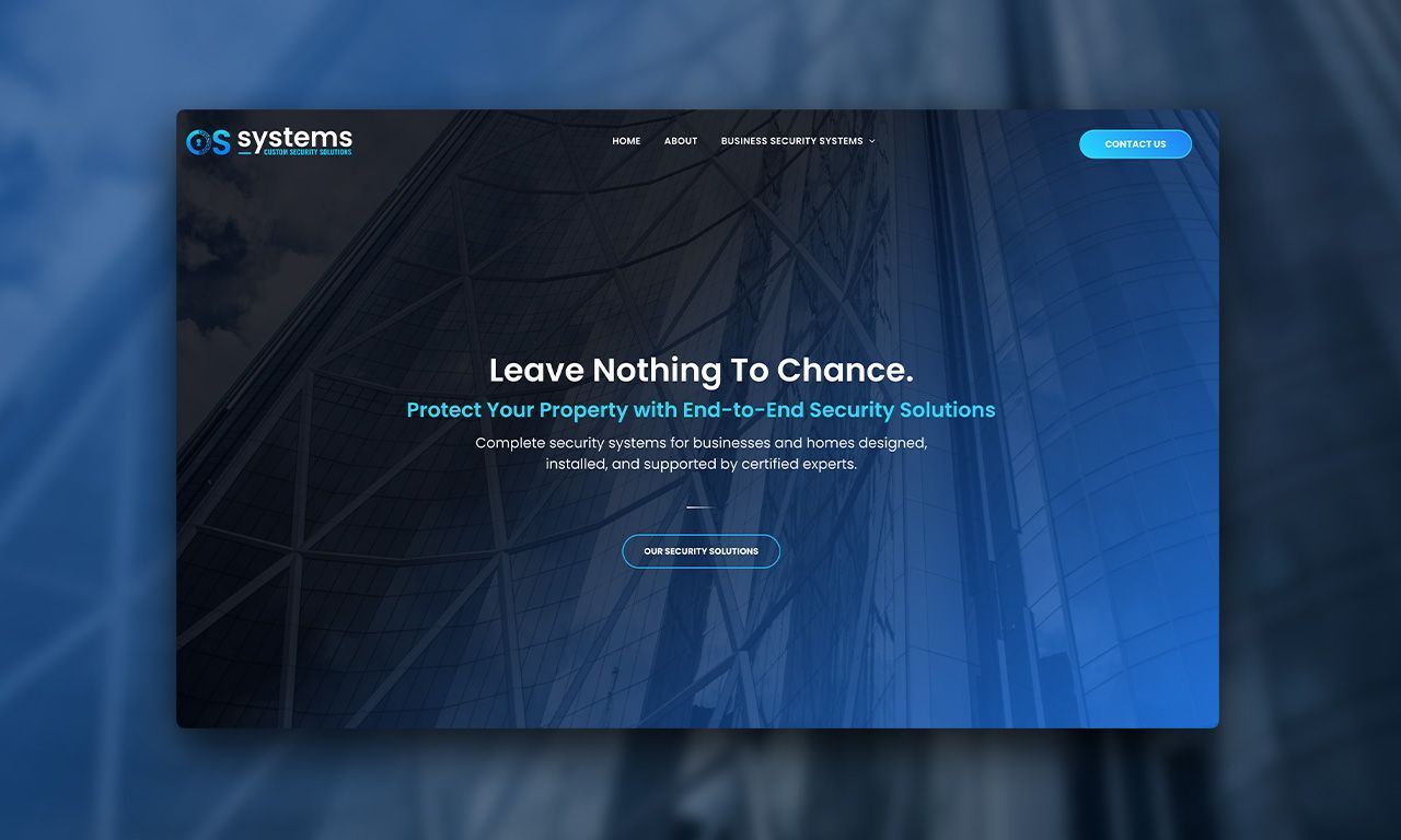
To help reach this goal we set out to create a bold but approachable brand that clearly communicated professionalism, innovation, and trust. The new identity started with a new logo: a stylized “O” embedded with wiring, circuitry, and a lock icon. This not only made the logo recognizable, but also reinforced OS Systems’ role in delivering smart, integrated security solutions.
To support the new look, we introduced:
- A tech-forward iconography set
- A colour palette built around blues and teals (trust, safety, innovation)
- Clear, confident typography using Poppins for body and Oswald for the tagline
- A refreshed brand statement: Custom Security Solutions, summarizing their commitment to personalized, high-tech protection
Website Redesign
The previous site lacked structure and didn’t clearly explain what OS Systems offers. We started by reorganizing the content so users could quickly understand services and navigate intuitively.
We aligned the site’s look and feel with the updated branding, carrying over the iconography, colour scheme, and messaging. Clean layouts and clear service categories helped build trust and improve the user experience.
The result? A website that finally reflects OS Systems’ capabilities—and one the client was genuinely excited about.
"Personally I love it, the webpage was sitting on my desktop all night and this morning its on my second screen all the time - just blessed."
~ Sergey Varushin
More Integrated Marketing Insights from CCC